Monday 24 September 2007
28 Weeks Later

Tobacco - it's worse than you think

Found this advert the other day, and thought it was pretty good. It's by Portugal's Young & Rubicam. The theme is obviously anti-smoking. You look at it first and think "oh it's just a cigarette" and then realise what it's made up of. I love the way the copy is perfectly echoed by the image - it's clearly a cigarette made up of one part heroin, one part cocaine. Apologies for the bad shot.
Sunday 23 September 2007
Halo 3 Believe

Dave - 'the home of witty banter'

In an interesting move this week, TV channel UKTV has announced it is rebranding its G2 channel 'Dave'. The channel carries programs such as Top Gear and Never Mind The Buzzcocks. The reasoning behind this name change is that 'everyone knows someone called Dave'. Dave's boss, Steven North, added: "Changing the channel name to Dave enables us to create a strong and noisy personality for the channel that immediately aligns us with our core 16-34 male audience."
I quite like the promo material for this, as shown above. Clarendon is a good choice for a font, being pretty trendy at the moment...and then you've got the giraffe indoors...crazy! The slogan is good as well..."the home of witty banter" - exactly what the core market is interested in. I think it's a good idea; the only other male-oriented channel is probably Men & Motors, which has a pretty tame channel presence in comparison. It will be interesting to see what this develops into.
I also like being credited as the home of witty banter ;)
Saturday 15 September 2007
And now on Weetabix...

Tuesday 11 September 2007
HP Blackbird 002 Gaming PC

Saturday 8 September 2007
Javier Ferrer Vidal
Ms. Dewey

Developed by graphic designers McCann-Erickson San Francisco and developer EVB, the website appears to be a means of trying to create more immersion with the internet. Most people simply spend their time on the internet inputting data into small boxes, so it's nice to see something interactive based around such a simple premise.
It's sort of in the same vein as Burger King's 2004 Subservient Chicken website, but much slicker. The background is of a stylish cityscape, and the character, Ms. Dewey, is a smartly dressed businesswoman with a bit of 'sass' about her.
I was ruminating on the potential of immersion within website design a couple of posts back, so it's nice to see a big player such as Microsoft experimenting with this. It's certainly a big step forward from Google's very empty home page. However, Microsoft seems pretty loathe to promote this, relying instead on press coverage. It's a shame really considering how much work seems to have gone into this. There are 600 video clips of Ms. Dewey - surely enough content to allow it to quite literally 'speak for itself'? Or is Microsoft afraid of appearing too forward-looking? Do they prefer to present a more recognisable face as they do with their main Live Search page? That is certainly much more Google-like.
http://www.msdewey.com/
http://www.live.com/
Friday 7 September 2007
Adobe Creative Licence
http://www.adobe.com/creativemind/
Sonja Mueller Photography
Here's a great website with a lot of subtle style. Sonja Mueller is a German photographer who lives and works in Berlin. For her portfolio site, she commissioned international web design firm Less Rain, and the result is a good one. The website's main menu is situated behind trees in a forest, and as you move the mouse the perspective changes, allowing you to see more options. When you click on something, the boxout blossoms, quite literally, in a branch or flower shape containing the information. The ambient background music and mouseover sounds add to the experience. It's a good balance of style and substance.
The designers, Less Rain, have a showreel worth checking out here:
http://www.lessrain.com/index.php?localeISO=en_UK
I particularly like their playful use of weather symbols. They look almost japanese-inspired.
The Unseen Video
http://www.theunseenvideo.com/index.html
The aim of the German designers who created it was "...to create new synergies between the music, the video and the surroundings of the viewer." And this got me thinking about immersion, and the role that it plays in how a message is received. For example, if you can't hear something properly, you won't understand it properly. But conversely, if you're absolutely and totally immersed in something, you'll not only remember it well but'll allow it to really penetrate your subconscious. So obviously a good thing for advertising monkeys.
How could a large company acquire this kind of depth of immersion? Could we see TV adverts that react dynamically in the same way that this video does? There are limitations on the technology, but why not? In the future can we not expect completely targeted advertising, as seen in the film Minority Report? Advertising that genuinely speaks to you on your level, instead of having to be pitched at a general audience? This is definitely something has got to happen. Advertising needs a new 'wow' factor.
Facade

The basic premise is as follows; you're a long-time friend of a married couple, and they've invited you over for dinner. As the evening progresses however, they start arguing about their marriage, and your objective is to make them understand each other properly and reconcile their differences. However, it's very easy to say the wrong thing and get kicked out of the appartment. Not only that; if they decide to split up, you lose as well.
The artistic style of the game is fairly basic, and you kinda feel it's been designed more by scientists than designers. But that doesn't detract from the novelty of how unique the game is.
The temptation to ask the characters inappropriate questions is a strong one, but if you persevere it's really fun, and pretty difficult too. It's great to have a snapshot of what the future of gaming could look like, done in something pretty basic like Flash.
Game website: http://www.interactivestory.net/
Gameplay demonstration: http://youtube.com/watch?v=GmuLV9eMTkg
Hard-Fi

Indie band Hard-Fi's new album cover features simply the band's name, the album title; 'Once Upon A Time In The West' and the text 'No Cover Art'. The cover is a response to the band to their debut album, 'Stars Of CCTV' which featured the silhouette of a security camera and won Best Record Sleeve of 2005.

Frontman of the band, Richard Archer, said "The significance of album covers is becoming little more than a centimetre square on an iPod screen. The sleeve used to add another dimension to an album, but that seems to be disappearing, which is really sad. We don't need some airbrushed band shot just because it might be expected. Fuck that. This is about the music."
The first single from the album will feature the words 'EXPENSIVE BLACK AND WHITE PHOTO OF BAND NOT AVAILABLE'.
'No Cover Art' on the front of the album is quite subversive. When I first spotted this in HMV, I wondered if it was a pre-release or something. But then you notice the stylish typeface and realise it can't be. Archer makes a good point; so many record sleeves are simply about a moody photo of the band, reclining in uncomfortable poses. It's nice to see something a bit different.
However, I do fear the decline of the record sleeve. For me, half the fun of buying a record is the packaging and design. The packaging helps reinforce the aural message that the record gives. Downloading music is not something I favour because the music usually just feels soulless without the accompanying artwork. Will the iPod be the death of the record sleeve? I hope not, but these days it seems it's only a minority of us that enjoy good design.
David VS. Goliath

They introduced a colour-blind test for people buying their jeans, to tell if people could recognise the difference between the Levis label and the Howies label. They set a spelling test; could consumers spell words like oppresion and corporation, and they distributed stickers to cover Levis labels. They gained so much publicity from this that Levis couldn't stand it, so their lawyers called a meeting to stop it. Howies said they'd need a room big enough to fit all the press in, and Levis weren't too keen on that. So Howies suggested that they should arm wrestle for the results, and Levis clearly decided their money-grabbing fat cats weren't really up to that kind of physical exercise.
It's great that a small company can stand up to a big evil corporation. It's great that Howies were so focussed and original in the way they did it. And it's great that they won. Hooray for David!
Thursday 6 September 2007
SimplyInteractive.net
Maybe nothing particularly remarkable, but it's smart and stylish and sometimes that's all that matters.
www.simplyinteractive.net
L.E.D. not I.E.D.
On his way to work on January 31st, a commuter spotted one of the placards at a traffic intersection and called the police. The bomb squad were summoned and the entire area was sealed off. An investigation was launched to find the other placards and whoever was responsible.

It took the police six hours to realise that the devices were not dangerous, but this was not before part of Boston was brought to a standstill as major traffic routes were closed. The police found that the placards shared several characteristics of improvised explosive devices, but not the actual explosive itself.
The two men responsible for the devices, artists Peter Berdovsky and Sean Stevens, were arrested and put on trial for using a hoax to incite public panic. The trial went on for a few months, but when it became obvious that the two men did not intend the devices to incite harm, they were let off with 60 and 80 hours of community service. The marketing company, Interference Inc, and Turner Broadcasting were ordered to pay out $2 million in damages. And Aqua Teen Hunger Force got a hell of a lot more publicity than they expected.
As an exercise in gorilla advertising, it's a great example. The ads were placed in obvious places and were very distinctive. With a lack of copy accompanying them, those unintiated to Aqua Teen Hunger Force were left guessing what on earth the placards stood for. And besides the legal complications, the campaign was very successful due to the added publicity it gained from being an apparent bomb scare. One wonders if this was not the intention in the first place; after all, it wouldn't be the first time an advertising campaign was created to deliberately cause controversy.
Tuesday 4 September 2007
The London Underground Map

The London Underground map is one of the most enduring pieces of graphic design the world has ever seen. London's subterranean rail network was first built by seperate companies in the late 1800s, but it wasn't until 1906 that anyone produced a unified map for it. Early maps, however, tended to contain a lot of information (such as streets and other local features) and were not consistent in their design.
The first proper map was designed in 1933 by Harry Beck. Beck was an employee of the Underground who realised that as much of the travel took place beneath the surface, the physical locations of the stations were irrelevant to travellers who simply wished to get from A to B. Thus, the best design for a map was to make it as simple as possible, making it topographical. Initially, the map and used the minimum of symbols, a tick mark for a station and a diamond for an interchange. Corners were all at 90 or 45 degrees.
Despite the complexity of the work, Beck was paid only 5 Guineas, but continued to on it up until 1960. The design has been updated and modified in certain ways, but Beck's design is still very much key.
For the legibility of the typeface, we have Frank Pick, Chief Executive of London Transport (1913-1938) to thank. Pick was very interested in the visual arts and was responsible for commissioning the font and the iconic Underground logo. Pick asked calligrapher Edward Johnston to design the font in 1915, and after collaboration with Eric Gill (he of Gill Sans fame), Johnston Sans Serif was produced.
The legacy of the map lives on with many tube networks around the world adopting Beck's simple and effective design. The map now stands as a symbol of London, with 60 million reproductions by merchandise companies every year. Additionally, artist Simon Patterson's 1992 work The Great Bear is an excellent spoof of the map, replacing the station names with those of famous characters throughout history.

Lastly, a quote from Frank Pick:
"The test of the goodness of a thing is its fitness for use. If it fails on this first test, no amount of ornamentation or finish will make it any better; it will only make it more expensive, more foolish."
Very true.
Oxo Tower, London
south bank.

This building was originally constructed in the late 19th Century as a power station for the Post Office, but was subsequently acquired by the Liebig Extract of Meat Company, makers of Oxo beef stock cubes. The building was heavily modified in an Art Deco fashion by the company architect, and the plan was to build a tower that would be festooned with advertisements and the company logo. However, planning regulations were pretty restrictive, and Oxo was refused permission. As a result of this, a tower was built with four sets of three vertically-aligned windows, which just happened to spell out the company's name.

As you can see, it looks pretty stylish even now and is a clear advertisement for Oxo stock cubes without breaking any rules. It's a great example of good design's capability to get around a problem. I think the methodology actually adds to it; placing big billboard advertisements showing the logo and product were getting pretty old even then, and the subtlety of this makes it look pretty unique.
Monday 3 September 2007
Nissan Qashqai by TBWA

The Nissan Qashqai is a new car from Nissan that's attempting to mix two established genres of car; the hatchback and the 4x4. Nissan decided that the best market segment to target this at would be young to middle-aged men, and so an advertising campaign was required to target the product correctly. TBWA came up with the idea of showcasing the cars in the fictional "Qashqai Car Games", a sport much like competitive skateboarding, where the cars would be driven off ramps and perform tricks.

The campaign started before the car's launch with a series of viral advertisments in which the cars, drivers and settings would be introduced. One advert shows some young men on the way to see an event hidden in a container dock, only to be rumbled by the police, and them running away. The stunts that the cars perform in the adverts are clearly extremely dangerous, not to mention largely impossible, so the advert is clearly computer animated. But I don't think the stunts lose too much from this; the urgency and speed that the computer animation lends them makes them look like real skateboards. It makes the cars look really nimble, which is exactly the point of a small 4x4.
Besides the fact that I personally find 4x4s morally reprehensible, these adverts are pretty damn good. They really work as virals because they're well enough shot as to create an illusion of reality surrounding the 'sport', leave you curious, and wanting more.
The rest of the campaign consisted of print and television advertisements, most notably the television ad being the one of a man standing on a Qashqai, 'skating' it around a city. The advert showcases the agility of the car, and finishes with the skateboarder sliding it perfectly into a car parking space.
It's nice to see car and advert producers doing something a little bit different, not only for the prospective consumer, but for everyone else who has to sit through adverts.
Camouflaged Bibles

Never fear, Christian Outdoorsman is here. Offering a selection of camouflaged bibles for the hardcore Christian hunter, including the 'NIV Bible In Realtree Camo' ("It's finally here... a Camo bible in NIV! It is also The only Bible in Real Tree Hardwood Green!") and boys and girls models. What a crazy idea for a USP. Still, you gotta love people who are willing to chance strange ideas; after all, that's what entrepreneurialism and creativity are all about.
Only in America though.
"It's all swings and landmines to me"


A great idea for an ambient media campaign. As Leger rightly points out, people often fail to see things until they're right in front of them, and what could be more eye-catching than a bloody great landmine? Especially in such a setting, an oasis of calm where parents hope their precious ones are safe and sound. I think it would definitely have an effect on me. Kids can and do get blown up by landmines regularly, and the tradegy is that its all old news these days. Everyone's apathetic. In a Fathers For Justice stylee, this is exactly what needs to be done to get people's attention.
Leger calls himself an "artivist", a fusion of artist and activist.
Brands of the World & Ads of the World
www.brandsoftheworld.com
www.adsoftheworld.com
Too old to be in an anti-aging ad...
Sunday 2 September 2007
Channel 4 Idents
Love 'em. No other channel has such diverse, intriguing and stylish idents, or channel presence for that matter. BBC2 used to be the best, with their variations on the '2' (robotic 2, flying 2 etc. etc.), but 4Creative's launch of these idents a couple of years back was a great idea. They took the traditional segmented 4 logo, and dragged it into the 21st Century, without losing its sensible look.
Don't Lose Your Sense Of Wonder

I found this photo on Paul Neave's Flickr page. I think it sums up creativity pretty well. Isn't our sense of wonder what provides the fuel for our ideas? Isn't it what makes us question the world around us, and the possibilities therein? Definitely.
It's our sense of wonder which makes us curious. We question "what would happen if I put that over there" or "what would happen if I used that colour, instead of the boring blue that I already chose." Our sense of wonder is what inspires us everytime we see something new. It's why we appreciate the spectacular and the diverse. And it's key to creativity.
Thinking about it, it's probably children who have the biggest sense of wonder out of all of us. They're the ones who have no inhibitions, they just throw a load of paint on the floor and don't really care. But this gets hammered out of us as we get older and inevitably more jaded with what we see around us. It's this seeing things without inhibitions which is key to creativity. The best creative experts will tell you never to bound your ideas with what is possible and what isn't possible. Phone network Orange, for example, don't even include technicians on the design staff, therefore avoiding 'idea-killers'. And isn't it the strangest and simultaneously most creative people who always create the most incredible pieces of work, be they art or science?
Taking the ideas of others and being inspired by them doesn't mean simply ripping them off. It means you take the underlying message, or emotion, or merely the buzz of seeing it, and apply it to your own work. This is key to remaining capable of producing work that is both fresh and unique.
Neave.com
On display are a selection of retro games lovingly recreated, Neave TV (where I found the beforementioned video), a random flower generator, your imagination, a planetarium, Flash Earth, a really trippy strobe, and my personal favourite - a graphic representation of whatever music you're playing.
The site is immaculately designed. I really like the way that the edges of the main menu morph depending on what you mouseover. His Flickr photos are worth checking out too.
Optical Illusions
http://www.neave.tv/#wba_cage
Eduardo Recife
Recife's corporate website shows an impressive variety of work for clients such as HBO, Rip Curl and the band Panic! At The Disco. Very graphic in style, it makes use of photos and textures along with type to create images that verge on the abstract.

I particularly like this t-shirt design; especially the typography as its so well visually balanced. The blue is just the right shade too, and the subtle gradient helps it to stand out.

The above image is great because of how it manages to balance retro aesthetic with more modern design principles and ideas. The background is nicely textured too; subtle but a good touch.
Los Logos

BioShock
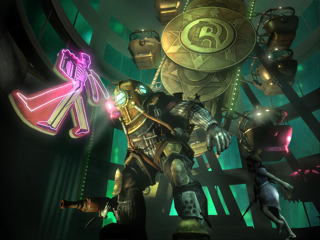
I recently picked up a new game for the PC, BioShock. This game has received a lot of hype over the past few months because of its unique setting in an underwater city gone mad, and the amazing art deco look that the designers have worked into the game. It's great to see games designers creating something that isn't simply a succession of grimy corridors, and instead an environment that really feels alive. Some parts look amazing.

The game takes influences from Aldous Huxley's Brave New World and Ayn Rand's novel Atlas Shrugged; both books about mankind's quest for perfection that ends in tradegy. This is a setting that allows a rich diversity of storytelling and character development, and the experience is quite a harrowing one. The desperation of the last remaining sane inhabitants is communicated through a series of audio diaries, and slowly a tale of best intentions mired by the basic flaws of human nature surfaces, quite literally, from the deep.

The artwork featured in the game is well produced, really helping to add to the illusion of immersion in another world. Sound design is excellent too - often an overlooked feature in video games; here it comes alive with a score that adds so much feeling and emotion to the game. You really believe you're actually there.

The designers even released a downloadable artbook which contains the key stages of artwork development that went into the game, including the logo design.
"Everyone should be able to experience the beauty of BioShock, see the concept art and visualize the evolution of building such a revolutionary game."
http://www.2kgames.com/cultofrapture/artbook.html
All in all, an amazing piece of work, and if you can you should pick it up. The game's out on PC and Xbox 360.
Saturday 1 September 2007
The Beetles

Fiery Fries

Clearly, it's a chip dipped in sauce, designed to resemble a match. The copy is so simple; just 'Fiery Fries' and then the Burger King logo. It's a great example of the phrase "A picture tells a thousand words." There's no need for any more copy because the image does the job perfectly. Since words are often substitute for images, Saatchi & Saatchi Singapore decided to jump straight to the point, and avoid unnecessary waffle.
It's a map...but not as we know it Jim...
http://www.robotwaronearth.com/images/chavmapfull.gif
I especially like the "Knives and broken bottles are restricted to the front carriages only" and "Handbags are stolen Wednesdays to Thursdays. Wallets and mobile phones at all other times."
It's another testament to the visionary design of Harry Beck's original 1933 Underground map.
In fact, that's probably worth writing another entry about.
Desktopography
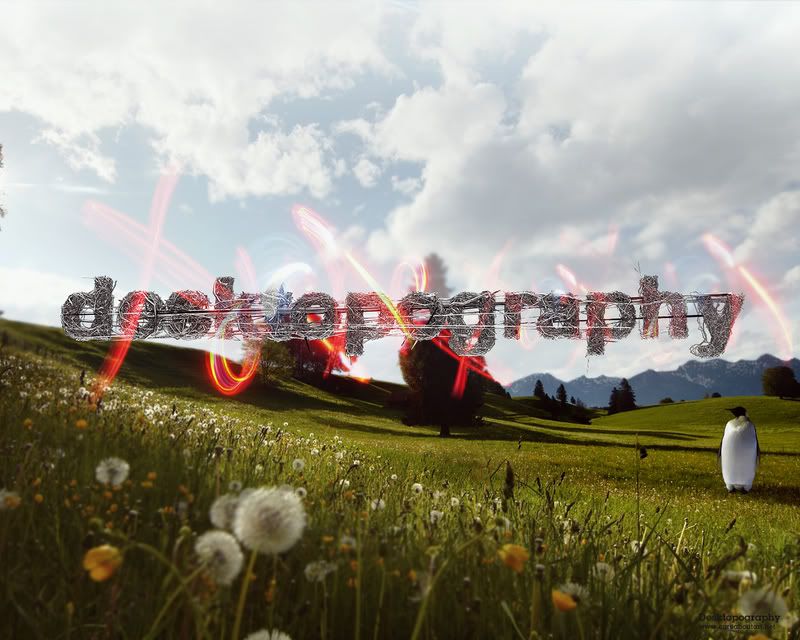
http://www.pixel.customize.org/
The new 2007 collection has just been launched, and it's really impressive. Great, if like me you have a fetish for rampantly abstract brightly coloured awesomeness. I have a feeling that I might spend more time staring at my desktop than at Photoshop now. Oh well, at least I'll be staring at something worthwhile.
"This film is inspired by actual events..."
http://www.weworkforthem.com/
First on my list of notables includes a short film (seventh down on the page) based around events that took place one evening in 1886:
"On March 9, 1886, as Verne was coming home, his twenty five year old nephew, Gaston, with whom he had entertained lengthy and affectionate relations, charged at him with a gun. As the two wrestled for it, it went off. The second bullet entered Verne's left leg. He never fully recovered. Gaston spent the rest of his life in an asylum, and the incident was hushed up by the media."
I really like the way this is filmed. They've taken the basic premise of the story and worked their own style of art direction into the piece. It sort of reminds me of a piece of opera, in the way that the story is portrayed in means other than just acting. Art of course, is basically just a representation of an object or scene, infused with the artists own extrapolations, feelings and skills. And that's what they've done here. The sound design is great; it tells part of the story instead of merely being an accompaniment to it. The moody crackles that are in the background at the start of the film set the tone for its events; is it the similarity to the sound of thunder that helps this along?
Additionally, take a look at this:
http://www.weworkforthem.com/knbsc505.php
It's really weird, but I like it. I'm not sure what to make of it really...but isn't that the point of abstract art?
