Recife's corporate website shows an impressive variety of work for clients such as HBO, Rip Curl and the band Panic! At The Disco. Very graphic in style, it makes use of photos and textures along with type to create images that verge on the abstract.

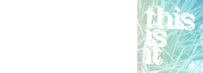
I particularly like this t-shirt design; especially the typography as its so well visually balanced. The blue is just the right shade too, and the subtle gradient helps it to stand out.

The above image is great because of how it manages to balance retro aesthetic with more modern design principles and ideas. The background is nicely textured too; subtle but a good touch.

No comments:
Post a Comment