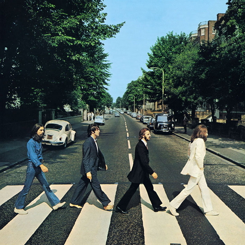
Another example of some excellent print advertising is the following piece from Volkswagen. Everyone has seen the cover of The Beatles' final album, Abbey Road, with its iconic photograph of the four band members crossing the street by their recording studio in August, 1969.

Norwegian creative agency Bates Reklamebrya saw this, and clearly decided it was ripe for parody, replacing the band with five different coloured new Beatle cars.

The copy reads simply; "The Beetles".
Excellent again for it's sheer simplicity and strength of concept. The length of detail is also impressive - they've parked an old Beetle in exactly the same place as it is in the original photo, and an old van on the other side of the street. The association that comes with this parody is worthwhile; the Beatles have always been seen as cool and laid back; the icons of a generation, and Volkswagen Beatle has a similar image, tending to be driven by elderly hippies and students.
Simplicity is the key. If you remove the need to process the information (such is the requirement with an advertisement heavy on copy), you remove the ability for the subject to add as much of his own feeling and opinion to it.


1 comment:
Heh, really cool. Thanks for posting this.
Post a Comment