
Check it out:
Thursday, 20 December 2007

Saturday, 1 December 2007
Wednesday, 28 November 2007
Thursday, 22 November 2007
Simplifying Communication
Communication may have evolved in the past several thousand years, but new challenges constantly emerge. A key challenge is in IT. As I mentioned earlier, communication has evolved when faced with the internet and modern technology. But a whole subset of new words has sprung up - some user-created, and some created as a means of communicating about the new technology. People often find these terms confusing - even as a regular internet user, I often find myself looking things up. Could a device to help people be created? A dictionary? Some kind of translation tool for older folks or cave-dwellers who've never used the internet?
Friday, 16 November 2007
Examples of written communication, and how it adapts to survive
Written communication is so prevalent these days you absorb thousands of words every day. But how has it evolved with the development of technology, and does it still have a place in the modern world?
Since Gutenberg's bible in 1450 revolutionised the reproduction of the written word, standards of grammar and letterform have decreased and increased. Words have become easier to read in some ways, and more difficult to read in others.
As printing developed, the letterforms and typefaces moved slowly away from the emulation of handwriting and into a style of their own. Serifs came and went, and came back again. Sans-serif fonts were developed. And then came the advent of the Biro, the Internet and mobile phones.
The biro has a lot to answer for. It was created by a newspaper editor in the 1940s as an alternative to his fountain pen which often tore up his notepaper and took a while to dry. László Bíró created the most popular pen in the world, the Biro, and handwriting standards plummetted. Because people had to make less effort writing, they took less care over it. Handwriting either became incredibly basic or very scruffy, with little standardisation. But thankfully the printed word was still around to ground the letterforms.
The internet has warped and twisted communication more than many would have thought possible - so much so that there is a entire argot of slang called 1337 (or Leet). Leetspeak originated on the internet forums of the 1980s where a 'leet' (or e-lite) user would be respected for his knowledge, and it was handy in getting round word filters. Nowadays, Leet can be seen all over the internet, and is used by nearly everyone in some form or other. Smilies and expresions such as 'LOL' (laugh out loud) are especially popular. Additionally, character substitution often occurs - for example - "l33t sP33k is U8er keWl 4nD eA5y wehn u 7hink 1t tHr0uGh."
Leet has migrated and evolved onto mobile phones, where the constraints of a very basic text input method, a small screen and a character limit forced texters to innovate. Common expressions include 'C U l8r' (for 'See you later').
It is interesting to consider whether these evolutions of language have any affect on formal writing. Certainly they do, but does formal writing have anything to fear? Obviously it would not be appropriate to write in l337-speak in an essay, but what's wrong with time-saving?
This brings me on to George Orwell's 1949 novel, 1984. Besides being an incredible work of dystopian literature, Orwell raises some relevant points. For example, the administration of the book's setting, Oceania, have created a language called 'Newspeak' which basically involves ripping words apart to increase efficiency. Is this a bad thing? Is the decrease in variety acceptable at the increase of speed and fluency?
Since Gutenberg's bible in 1450 revolutionised the reproduction of the written word, standards of grammar and letterform have decreased and increased. Words have become easier to read in some ways, and more difficult to read in others.
As printing developed, the letterforms and typefaces moved slowly away from the emulation of handwriting and into a style of their own. Serifs came and went, and came back again. Sans-serif fonts were developed. And then came the advent of the Biro, the Internet and mobile phones.
The biro has a lot to answer for. It was created by a newspaper editor in the 1940s as an alternative to his fountain pen which often tore up his notepaper and took a while to dry. László Bíró created the most popular pen in the world, the Biro, and handwriting standards plummetted. Because people had to make less effort writing, they took less care over it. Handwriting either became incredibly basic or very scruffy, with little standardisation. But thankfully the printed word was still around to ground the letterforms.
The internet has warped and twisted communication more than many would have thought possible - so much so that there is a entire argot of slang called 1337 (or Leet). Leetspeak originated on the internet forums of the 1980s where a 'leet' (or e-lite) user would be respected for his knowledge, and it was handy in getting round word filters. Nowadays, Leet can be seen all over the internet, and is used by nearly everyone in some form or other. Smilies and expresions such as 'LOL' (laugh out loud) are especially popular. Additionally, character substitution often occurs - for example - "l33t sP33k is U8er keWl 4nD eA5y wehn u 7hink 1t tHr0uGh."
Leet has migrated and evolved onto mobile phones, where the constraints of a very basic text input method, a small screen and a character limit forced texters to innovate. Common expressions include 'C U l8r' (for 'See you later').
It is interesting to consider whether these evolutions of language have any affect on formal writing. Certainly they do, but does formal writing have anything to fear? Obviously it would not be appropriate to write in l337-speak in an essay, but what's wrong with time-saving?
This brings me on to George Orwell's 1949 novel, 1984. Besides being an incredible work of dystopian literature, Orwell raises some relevant points. For example, the administration of the book's setting, Oceania, have created a language called 'Newspeak' which basically involves ripping words apart to increase efficiency. Is this a bad thing? Is the decrease in variety acceptable at the increase of speed and fluency?
Thursday, 15 November 2007
Written Communication
What exactly is written communication? To define this I must define communication.
Communication is the process whereby information is transmitted using a common set of rules. There are various ways this can be accomplished, and the simplest method is speech. But obviously speech isn't always practical, and that's why written communication exists. Written communication is all around us - on signs, product packaging and the like. And it has adapted and evolved to represent the needs of the society that uses it.
Written communication has its origins in cave paintings - some forty-thousand years old. The purpose of cave paintings is not known, but it is speculated that they had religious/spiritual significance, and were used to record events. Until six thousand years ago, man had relatively little need for written communication, but this changed as trade and finance developed. There was simply too much information for all of it to be stored in the memory, so people began to record it in a permanent form. The mesopotamians had a system of clay tokens to representing commodities, and by the fourth millenium BC this had evolved into using a stylus to carve numbers into soft clay. The mesopotamiams then started carving pictures to represent what was being counted, and the development of written language began.
There are broadly four methods of writing; Logographies, Syllabaries, Alphabets and Featural scripts. Logographies represent words with single symbols that look like what they are representing. Chinese is an example of this. A Syllabary language is one that represents syllables with single characters - Japanese for example. An Alphabet language uses letters to form the basis of words - for example, English. And lastly, a Featural language uses symbols to denote certain sounds.
The world's oldest known alphabet was developed by the Egyptians in 2000BC from their hieroglyphic system, and it spread to Canaan and eventually the rest of the world. As it spread, people realised the importance of a system of language that was easily constructed by everyone and could be written with the most basic of tools. Written language continued to develop as technology improved. Letters and words were carved into clay and wood, and then into forms of paper. The invention of printing in the mid 1400s by Johannes Gutenberg revolutionised the written word even more. Letters became more standardised, and the idea of different typefaces emerged.
Communication is the process whereby information is transmitted using a common set of rules. There are various ways this can be accomplished, and the simplest method is speech. But obviously speech isn't always practical, and that's why written communication exists. Written communication is all around us - on signs, product packaging and the like. And it has adapted and evolved to represent the needs of the society that uses it.
Written communication has its origins in cave paintings - some forty-thousand years old. The purpose of cave paintings is not known, but it is speculated that they had religious/spiritual significance, and were used to record events. Until six thousand years ago, man had relatively little need for written communication, but this changed as trade and finance developed. There was simply too much information for all of it to be stored in the memory, so people began to record it in a permanent form. The mesopotamians had a system of clay tokens to representing commodities, and by the fourth millenium BC this had evolved into using a stylus to carve numbers into soft clay. The mesopotamiams then started carving pictures to represent what was being counted, and the development of written language began.
There are broadly four methods of writing; Logographies, Syllabaries, Alphabets and Featural scripts. Logographies represent words with single symbols that look like what they are representing. Chinese is an example of this. A Syllabary language is one that represents syllables with single characters - Japanese for example. An Alphabet language uses letters to form the basis of words - for example, English. And lastly, a Featural language uses symbols to denote certain sounds.
The world's oldest known alphabet was developed by the Egyptians in 2000BC from their hieroglyphic system, and it spread to Canaan and eventually the rest of the world. As it spread, people realised the importance of a system of language that was easily constructed by everyone and could be written with the most basic of tools. Written language continued to develop as technology improved. Letters and words were carved into clay and wood, and then into forms of paper. The invention of printing in the mid 1400s by Johannes Gutenberg revolutionised the written word even more. Letters became more standardised, and the idea of different typefaces emerged.
Sunday, 11 November 2007
Sony Ericsson - I Love Music
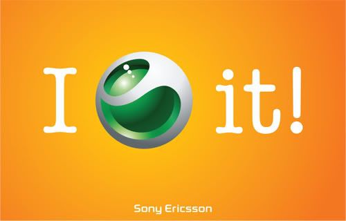
I've noticed this ad campaign around in the past few months, and I've been impressed with how clever it is. Let's have a look at one of the TV adverts:
The great thing about this ad campaign is that it subverts what we expect to see with what it wants to advertise. Try saying one of the phrases; for example "I (sony ericsson logo) the rain" without saying "I love." It's just natural. The heart symbol is so often used as a substitute for the word Love that it's imprinted in our conciousness. It's much like the fact that it doesn't matter what order the letters in a word are because the brain recognises the word by the first and last letters. It doesn't matter what you actually see here, your brain tells you different.
The agency to thank for this are Wolff Olins, a branding agency with over 40 years in the business. They also do a lot of work for Orange, and are responsible for the questionable London 2012 logo.
"Mobile phone brands all talk about technology, backed up by fashion imagery that usually shows unattainable lifestyles. We helped Sony Ericsson to be different, and to talk to customers not about handsets or fashion, but about the things they love doing. Not MP4 but music, not megapixels but taking photos. We developed a vibrant range of colours which stand out and allow the brand to constantly refresh itself."
They've really hit the nail on the head here. It's kind of like what happened when Apple stopped selling computers and started selling lifestyle accessories. Suddenly, the consumer could identify with and understand the product. People don't want to know about the specifications of a product - they want to know what it does and what it looks like.
Since the campaign was introduced, the company's sales ballooned. Although Sony Ericsson have always had a trendy, stylish image, they had struggled to win market dominance from the likes of Nokia, and at last, they had an ad campaign that was memorable and clever. At last, someone at Sony Ericsson realised that the key to selling large quantities of anything is to sell it as a lifestyle accessory, and not just as a tool. To sell it as something people want to be seen with, and as something that allows people to appear as more than they actually are.
Wednesday, 17 October 2007
FAO Paul Wilson...Design that Inspires
Choosing two pieces of design that I really like is hard, but I found this one recently whilst browsing a packaging book. It's a CD cover design for an independant record label, showcasing the best of British. Instead of merely covering it with funky photoshopped graphics, the designers Stylo Studio went for a meat-packaging spoof, replacing the words "British Beef" with "British Beat".

The promotional CD came in the above package, a proper meat tray with the correct labelling. An image of beef was used on the actual CD. The general release product came in the following package:

This design is obviously much more conventional, but I still like the way they've followed the theme through, by maintaining the same print out on the CD and using the meat label as the front cover.
I guess I like it because it's a very simple idea, executed in a very concise way. Nothing is over the top, and everything comes together to make a piece of work that is clever, and fairly humourous too.
The other piece of work that I really like is the following:
http://davetherave87.blogspot.com/2007/09/beetles.html
The simplest and cleverest work is what appeals to me the most, in all of design. There's not much to think about, it's just pure concept executed perfectly.

The promotional CD came in the above package, a proper meat tray with the correct labelling. An image of beef was used on the actual CD. The general release product came in the following package:

This design is obviously much more conventional, but I still like the way they've followed the theme through, by maintaining the same print out on the CD and using the meat label as the front cover.
I guess I like it because it's a very simple idea, executed in a very concise way. Nothing is over the top, and everything comes together to make a piece of work that is clever, and fairly humourous too.
The other piece of work that I really like is the following:
http://davetherave87.blogspot.com/2007/09/beetles.html
The simplest and cleverest work is what appeals to me the most, in all of design. There's not much to think about, it's just pure concept executed perfectly.
Monday, 24 September 2007
28 Weeks Later

Watched this film again last night, and once again I really enjoyed just how visceral and pacy it is. I've been a fan of the franchise ever since I watched 28 Days Later a couple of years ago. I loved how fast-moving it was and just how ridiculously violent it was in some places. And strangely, I also really liked the complete sense of hopelessness that pervaded throughout the film. That sounds odd - how could you enjoy being depressed - but the way the film is shot and directed, you really feel for the characters and the situations they are put in.
I really like the long shots of deserted London - it's so surreal seeing London completely empty, like a ghost town - completely and totally un-natural, and really really eerie. Seeing Wembley stadium with grass a couple of feet high is just weird. The times that they chose to film these shots - often dusk and dawn, make them so much more powerful.
The film makers used circus performers and dancers to play the zombies, and the shaky, cross-cutting camera work really adds to the sense of reckless, horrible evil of the infected humans. Make-up was spot on too, with bleeding eyes, missing limbs etc. etc. And in the second film, Robert Carlyle looks scary as f*ck when he keeps appearing all over the place.
Another thing that struck me about the film was how good the music was. There's only really one major theme, but it's a great guitar-driven piece, full of slowly building momentum that gives me goosebumps everytime I hear it.
Lastly, the graphic design that went into the packaging and posters for the film creates a great presence. It's grungy, rough-edged design, with high contrast colours and desolate imagery.
All in all, this film franchise is an excellently packaged piece of work, a piece of work where all the important elements come together to create something bigger than the sum of its parts. Good stuff.
Tobacco - it's worse than you think

Found this advert the other day, and thought it was pretty good. It's by Portugal's Young & Rubicam. The theme is obviously anti-smoking. You look at it first and think "oh it's just a cigarette" and then realise what it's made up of. I love the way the copy is perfectly echoed by the image - it's clearly a cigarette made up of one part heroin, one part cocaine. Apologies for the bad shot.
Sunday, 23 September 2007
Halo 3 Believe

This is an awesome promo site for the new Xbox game, Halo 3. The designers have gone beyond the usual approach of providing a couple of screenshots and a nice flash interface, and actually built a model of a battle, which is fully interactive. The story is that it is a monument to a great struggle, and you can walk around it. You can control the camera to look at whatever you want and click on points of interest which add depth to the story. These include videos and first-hand accounts of the battle. It's really very impressive as a piece of website design - once again, an attempt at immersion, at telling a story or a message by way of interactiion. It's well known that if you tell someone something they're far less likely to remember it than if you made them do it. The whole concept really helps to add to the story and atmosphere surrounding the game. The music is also very fitting; the sort of sad, wistful piano music that suits the sadness that the designers wanted to create here.
I spent about half an hour looking at everything; there's a lot to see. You can download wallpapers, watch videos, take screenshots etc. It's very interesting and very well done, very believable. It's great to see designers taking so much effort to blend story and visuals together for something as simple as promotional website.
Dave - 'the home of witty banter'

In an interesting move this week, TV channel UKTV has announced it is rebranding its G2 channel 'Dave'. The channel carries programs such as Top Gear and Never Mind The Buzzcocks. The reasoning behind this name change is that 'everyone knows someone called Dave'. Dave's boss, Steven North, added: "Changing the channel name to Dave enables us to create a strong and noisy personality for the channel that immediately aligns us with our core 16-34 male audience."
I quite like the promo material for this, as shown above. Clarendon is a good choice for a font, being pretty trendy at the moment...and then you've got the giraffe indoors...crazy! The slogan is good as well..."the home of witty banter" - exactly what the core market is interested in. I think it's a good idea; the only other male-oriented channel is probably Men & Motors, which has a pretty tame channel presence in comparison. It will be interesting to see what this develops into.
I also like being credited as the home of witty banter ;)
Saturday, 15 September 2007
And now on Weetabix...

These TV adverts have been on for quite a while, and are a nice spin on the usual TV channel idents. The basic premise involves a shot of some Weetabix combined with a meal idea; for example Weetabix with fruit. The presentation is great; the Weetabix is shot against a blue background and there are some nice shots of the milk splashing over the 'bix, making them look a lot more appetising than just chunks of dry wheat. The background 'muzak' is exactly right as well; basically tuneless ambience just like most TV idents. I think my favourite ad is '6: Pudding' where the fruit comes out from underneath the Weetabix like the tools in a Swiss Army Knife. I just think its really clever.
The website continues the TV theme. The main navigation is contained within a television, a menu system similar to Sky's interactive controls. You can view all seven of the TV adverts, look at recipes, and enter a competition to win a stupidly large TV (presumably to watch while eating your Weetabix). The TV adverts are in the 'Commercial TV' section.
It's good to see Weetabix putting some effort into rejuvenating their brand. Especially when it's as well produced as this. Too many cereal companies rely on shooting mums and kids eating cereals at the breakfast table...which is dull frankly. The presentation of these new adverts encourages you to examine the possibilities in the humble 'bix. Instead of just treating them as the pappy wheat slabs they are. Setting them as TV idents catches your eye as well; to my knowledge no-one has tried this before. First time I saw one I wondered if ITV had been taken over by the evil cereal industry. But alas, thankfully not.
Good concept, clever methodology and good execution make this a winner.
Tuesday, 11 September 2007
HP Blackbird 002 Gaming PC

HP have just launched a new PC. And normally this would hardly be cause for notice, but this is not just any PC. This is the Blackbird 002. And it's pretty special. It's HP's first attempt at designing a PC to appeal to PC gamers and enthusiasts, and there's a pretty cool website behind it.
HP's design concept here seems to have been to make it look as like car advertising as possible. Everything's sleek. Everything looks really professional and stylish, with an industrial look that complements the case design. It's all rather good looking.
Maybe the website isn't particularly inventive, but it's nicely done. There are little touches, such as the "HP Labs 2007, Level 5 RAID/1.1KW Power, 10,000RPM Raptor Drive, 533MHz - 3000MHz" at the bottom right of the page. It's just like a car manufacturer boasting about their new sportscar.
I like the 'industrial-lite' theme that the site has - with the darker, subtler colours, stripes and stenciled sans serifs. The intro to the website is good as well; with the panning shots of the grilles and power buttons, you really think you're looking at something powerful and almost dangerous.
It's good to see PCs being marketed as more than just beige boxes.
Saturday, 8 September 2007
Javier Ferrer Vidal

Javier Ferrer Vidal is a Spanish photographer with a really excellent website. It's fashionably stylish without being cliched. I especially like the way your view of the grinning kid changes as you move the mouse, and the fact that your cursor is the menu button.
Ms. Dewey

Ms. Dewey is a website created in 2006 by Microsoft to promote Live Search, Microsoft's answer to Google. The website features a talking character who provides feedback on the terms that the user enters into the search box, and makes random actions while idle.
Developed by graphic designers McCann-Erickson San Francisco and developer EVB, the website appears to be a means of trying to create more immersion with the internet. Most people simply spend their time on the internet inputting data into small boxes, so it's nice to see something interactive based around such a simple premise.
It's sort of in the same vein as Burger King's 2004 Subservient Chicken website, but much slicker. The background is of a stylish cityscape, and the character, Ms. Dewey, is a smartly dressed businesswoman with a bit of 'sass' about her.
I was ruminating on the potential of immersion within website design a couple of posts back, so it's nice to see a big player such as Microsoft experimenting with this. It's certainly a big step forward from Google's very empty home page. However, Microsoft seems pretty loathe to promote this, relying instead on press coverage. It's a shame really considering how much work seems to have gone into this. There are 600 video clips of Ms. Dewey - surely enough content to allow it to quite literally 'speak for itself'? Or is Microsoft afraid of appearing too forward-looking? Do they prefer to present a more recognisable face as they do with their main Live Search page? That is certainly much more Google-like.
http://www.msdewey.com/
http://www.live.com/
Developed by graphic designers McCann-Erickson San Francisco and developer EVB, the website appears to be a means of trying to create more immersion with the internet. Most people simply spend their time on the internet inputting data into small boxes, so it's nice to see something interactive based around such a simple premise.
It's sort of in the same vein as Burger King's 2004 Subservient Chicken website, but much slicker. The background is of a stylish cityscape, and the character, Ms. Dewey, is a smartly dressed businesswoman with a bit of 'sass' about her.
I was ruminating on the potential of immersion within website design a couple of posts back, so it's nice to see a big player such as Microsoft experimenting with this. It's certainly a big step forward from Google's very empty home page. However, Microsoft seems pretty loathe to promote this, relying instead on press coverage. It's a shame really considering how much work seems to have gone into this. There are 600 video clips of Ms. Dewey - surely enough content to allow it to quite literally 'speak for itself'? Or is Microsoft afraid of appearing too forward-looking? Do they prefer to present a more recognisable face as they do with their main Live Search page? That is certainly much more Google-like.
http://www.msdewey.com/
http://www.live.com/
Friday, 7 September 2007
Adobe Creative Licence
Here's Adobe's minisite for their CS3 products. Pretty simple, professionally done (as one would expect from the mainstays of creative software engineering), and did I mention, I love the CS3 box designs! The rubix cube of programs is cool too.
http://www.adobe.com/creativemind/
http://www.adobe.com/creativemind/
Sonja Mueller Photography
http://www.sonjamueller.org/website/main.swf?navigationFilename=../data/content.php&code=default
Here's a great website with a lot of subtle style. Sonja Mueller is a German photographer who lives and works in Berlin. For her portfolio site, she commissioned international web design firm Less Rain, and the result is a good one. The website's main menu is situated behind trees in a forest, and as you move the mouse the perspective changes, allowing you to see more options. When you click on something, the boxout blossoms, quite literally, in a branch or flower shape containing the information. The ambient background music and mouseover sounds add to the experience. It's a good balance of style and substance.
The designers, Less Rain, have a showreel worth checking out here:
http://www.lessrain.com/index.php?localeISO=en_UK
I particularly like their playful use of weather symbols. They look almost japanese-inspired.
Here's a great website with a lot of subtle style. Sonja Mueller is a German photographer who lives and works in Berlin. For her portfolio site, she commissioned international web design firm Less Rain, and the result is a good one. The website's main menu is situated behind trees in a forest, and as you move the mouse the perspective changes, allowing you to see more options. When you click on something, the boxout blossoms, quite literally, in a branch or flower shape containing the information. The ambient background music and mouseover sounds add to the experience. It's a good balance of style and substance.
The designers, Less Rain, have a showreel worth checking out here:
http://www.lessrain.com/index.php?localeISO=en_UK
I particularly like their playful use of weather symbols. They look almost japanese-inspired.
The Unseen Video
I know this has been on the main GLOG, but I thought it was worth mentioning here as well. The Unseen Video is a weather controlled, dynamic music video for Mike Milosh's - You Make Me Feel song. The site works by hooking up to a weather server near you using your IP address to tell where you are, and this influences the look of the video depending on what your weather is like. Surprise surprise, it's usually dull and gloomy whenever I access it.
http://www.theunseenvideo.com/index.html
The aim of the German designers who created it was "...to create new synergies between the music, the video and the surroundings of the viewer." And this got me thinking about immersion, and the role that it plays in how a message is received. For example, if you can't hear something properly, you won't understand it properly. But conversely, if you're absolutely and totally immersed in something, you'll not only remember it well but'll allow it to really penetrate your subconscious. So obviously a good thing for advertising monkeys.
How could a large company acquire this kind of depth of immersion? Could we see TV adverts that react dynamically in the same way that this video does? There are limitations on the technology, but why not? In the future can we not expect completely targeted advertising, as seen in the film Minority Report? Advertising that genuinely speaks to you on your level, instead of having to be pitched at a general audience? This is definitely something has got to happen. Advertising needs a new 'wow' factor.
http://www.theunseenvideo.com/index.html
The aim of the German designers who created it was "...to create new synergies between the music, the video and the surroundings of the viewer." And this got me thinking about immersion, and the role that it plays in how a message is received. For example, if you can't hear something properly, you won't understand it properly. But conversely, if you're absolutely and totally immersed in something, you'll not only remember it well but'll allow it to really penetrate your subconscious. So obviously a good thing for advertising monkeys.
How could a large company acquire this kind of depth of immersion? Could we see TV adverts that react dynamically in the same way that this video does? There are limitations on the technology, but why not? In the future can we not expect completely targeted advertising, as seen in the film Minority Report? Advertising that genuinely speaks to you on your level, instead of having to be pitched at a general audience? This is definitely something has got to happen. Advertising needs a new 'wow' factor.
Facade

A friend recently referred me to the Flash game Facade. Facade was released in 2005, and is a story-based interactive game. So far, so Miniclip.com.
The game was written by two artificial intelligence researchers, Michael Mateas and Andrew Stern, who work at the University of Georgia. It took five years to create. So what's so special about it?
Facade is completely interactive. You're in a 3D room that you can walk about in, and just like in real life, you can speak, and your words influence the actions of the people in the game.
The basic premise is as follows; you're a long-time friend of a married couple, and they've invited you over for dinner. As the evening progresses however, they start arguing about their marriage, and your objective is to make them understand each other properly and reconcile their differences. However, it's very easy to say the wrong thing and get kicked out of the appartment. Not only that; if they decide to split up, you lose as well.
The artistic style of the game is fairly basic, and you kinda feel it's been designed more by scientists than designers. But that doesn't detract from the novelty of how unique the game is.
The temptation to ask the characters inappropriate questions is a strong one, but if you persevere it's really fun, and pretty difficult too. It's great to have a snapshot of what the future of gaming could look like, done in something pretty basic like Flash.
Game website: http://www.interactivestory.net/
Gameplay demonstration: http://youtube.com/watch?v=GmuLV9eMTkg
The basic premise is as follows; you're a long-time friend of a married couple, and they've invited you over for dinner. As the evening progresses however, they start arguing about their marriage, and your objective is to make them understand each other properly and reconcile their differences. However, it's very easy to say the wrong thing and get kicked out of the appartment. Not only that; if they decide to split up, you lose as well.
The artistic style of the game is fairly basic, and you kinda feel it's been designed more by scientists than designers. But that doesn't detract from the novelty of how unique the game is.
The temptation to ask the characters inappropriate questions is a strong one, but if you persevere it's really fun, and pretty difficult too. It's great to have a snapshot of what the future of gaming could look like, done in something pretty basic like Flash.
Game website: http://www.interactivestory.net/
Gameplay demonstration: http://youtube.com/watch?v=GmuLV9eMTkg
Subscribe to:
Posts (Atom)