Sunday, 2 September 2007

Los Logos


For my birthday a couple of months ago I got Dos Logos, the second book in the Los Logos trilogy by Die Gestalten Verlag. These are a series of books that contain thousands of logos by respected designers the world over, and as a source of inspiration are so much more than merely coffee-table material. The books are sorted into sections detailing logos designed for different purposes. On display is some really good work.


Los Logos, Dos Logos and Tres Logos are available for around £25 each.
Here's an interesting article about the publishers by Computer Arts:

BioShock


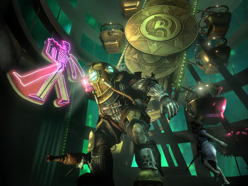
I recently picked up a new game for the PC, BioShock. This game has received a lot of hype over the past few months because of its unique setting in an underwater city gone mad, and the amazing art deco look that the designers have worked into the game. It's great to see games designers creating something that isn't simply a succession of grimy corridors, and instead an environment that really feels alive. Some parts look amazing.


The game takes influences from Aldous Huxley's Brave New World and Ayn Rand's novel Atlas Shrugged; both books about mankind's quest for perfection that ends in tradegy. This is a setting that allows a rich diversity of storytelling and character development, and the experience is quite a harrowing one. The desperation of the last remaining sane inhabitants is communicated through a series of audio diaries, and slowly a tale of best intentions mired by the basic flaws of human nature surfaces, quite literally, from the deep.


The artwork featured in the game is well produced, really helping to add to the illusion of immersion in another world. Sound design is excellent too - often an overlooked feature in video games; here it comes alive with a score that adds so much feeling and emotion to the game. You really believe you're actually there.


The designers even released a downloadable artbook which contains the key stages of artwork development that went into the game, including the logo design.

"Everyone should be able to experience the beauty of BioShock, see the concept art and visualize the evolution of building such a revolutionary game."

http://www.2kgames.com/cultofrapture/artbook.html

All in all, an amazing piece of work, and if you can you should pick it up. The game's out on PC and Xbox 360.

Saturday, 1 September 2007

The Beetles

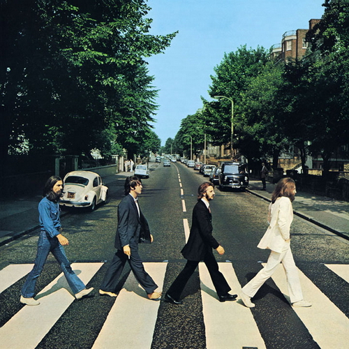
Another example of some excellent print advertising is the following piece from Volkswagen. Everyone has seen the cover of The Beatles' final album, Abbey Road, with its iconic photograph of the four band members crossing the street by their recording studio in August, 1969.


Norwegian creative agency Bates Reklamebrya saw this, and clearly decided it was ripe for parody, replacing the band with five different coloured new Beatle cars.


The copy reads simply; "The Beetles".
Excellent again for it's sheer simplicity and strength of concept. The length of detail is also impressive - they've parked an old Beetle in exactly the same place as it is in the original photo, and an old van on the other side of the street. The association that comes with this parody is worthwhile; the Beatles have always been seen as cool and laid back; the icons of a generation, and Volkswagen Beatle has a similar image, tending to be driven by elderly hippies and students.
Simplicity is the key. If you remove the need to process the information (such is the requirement with an advertisement heavy on copy), you remove the ability for the subject to add as much of his own feeling and opinion to it.

Fiery Fries

This is a great print ad that I came across today whilst reading an advertising book. It singlehandedly manages be both incredibly simple and yet very clever at the same time; which in my opinion is exactly what any advertisement should strive for.


Clearly, it's a chip dipped in sauce, designed to resemble a match. The copy is so simple; just 'Fiery Fries' and then the Burger King logo. It's a great example of the phrase "A picture tells a thousand words." There's no need for any more copy because the image does the job perfectly. Since words are often substitute for images, Saatchi & Saatchi Singapore decided to jump straight to the point, and avoid unnecessary waffle.

It's a map...but not as we know it Jim...

Who would have thought the London Underground map was so versatile? Burberry even have a version!

http://www.robotwaronearth.com/images/chavmapfull.gif

I especially like the "Knives and broken bottles are restricted to the front carriages only" and "Handbags are stolen Wednesdays to Thursdays. Wallets and mobile phones at all other times."

It's another testament to the visionary design of Harry Beck's original 1933 Underground map.
In fact, that's probably worth writing another entry about.

Desktopography


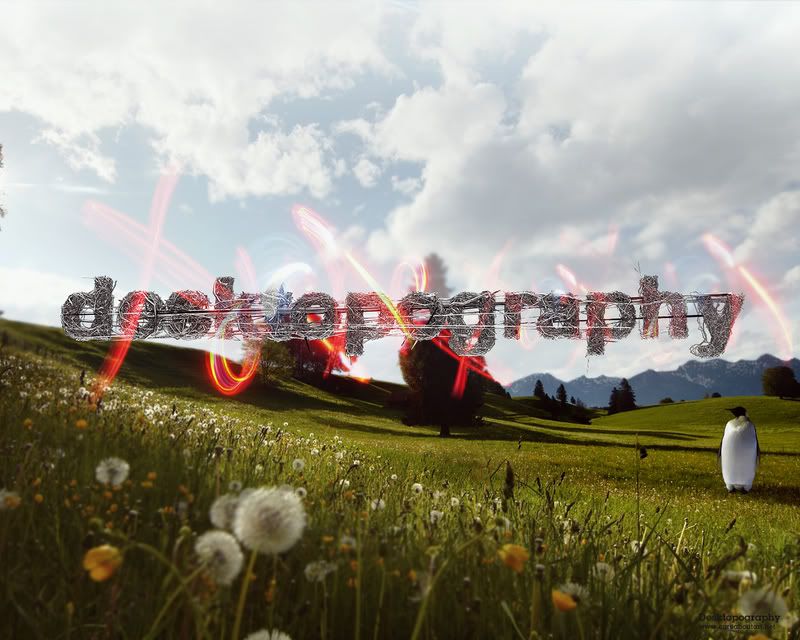
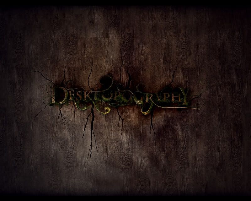
Long winter (-ish) nights getting you down? Bored of the standard swirly Mac wallpapers or that rubbish fake-looking green field in Windows? Have a look at:

http://www.pixel.customize.org/

The new 2007 collection has just been launched, and it's really impressive. Great, if like me you have a fetish for rampantly abstract brightly coloured awesomeness. I have a feeling that I might spend more time staring at my desktop than at Photoshop now. Oh well, at least I'll be staring at something worthwhile.


"This film is inspired by actual events..."

I recently had another look at WeWorkForThem.com, a website I used to frequent during my A-Level days, and I seem to have missed a lot of decent content.

http://www.weworkforthem.com/

First on my list of notables includes a short film (seventh down on the page) based around events that took place one evening in 1886:

"On March 9, 1886, as Verne was coming home, his twenty five year old nephew, Gaston, with whom he had entertained lengthy and affectionate relations, charged at him with a gun. As the two wrestled for it, it went off. The second bullet entered Verne's left leg. He never fully recovered. Gaston spent the rest of his life in an asylum, and the incident was hushed up by the media."

I really like the way this is filmed. They've taken the basic premise of the story and worked their own style of art direction into the piece. It sort of reminds me of a piece of opera, in the way that the story is portrayed in means other than just acting. Art of course, is basically just a representation of an object or scene, infused with the artists own extrapolations, feelings and skills. And that's what they've done here. The sound design is great; it tells part of the story instead of merely being an accompaniment to it. The moody crackles that are in the background at the start of the film set the tone for its events; is it the similarity to the sound of thunder that helps this along?

Additionally, take a look at this:

http://www.weworkforthem.com/knbsc505.php

It's really weird, but I like it. I'm not sure what to make of it really...but isn't that the point of abstract art?